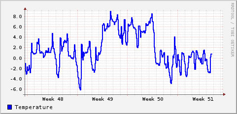
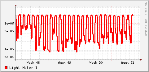
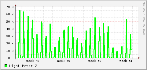
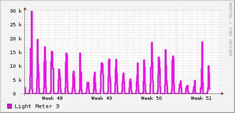
I have some data that I need to come up with a way to graph. I’m using the Light Pollution from Thüringer Landessternwarte, Tautenburg, Germany and our friends at Kuffner-Observatory, Vienna, Austria. I have this unit hooked up to take a reading every second. It records the temperature, and data from three light meters, one designed to capture low levels of light which is of interest to us for light pollution (plotted logarithmically below). Anyway the units for these are all different and I cant see a way to plot them all on the same graph with rrdtool. In practice I probably don’t want to plot them all, but I do want to overlay mathematical models on the graphs. For example to plot the altitude of the sun and/or moon altitude and phase on the graph to see how that correlates to the light meters.
So any suggestions on what I can use to create these? Data is in a mysql database; need to be able to script the graph generation also.
By the way Dalkey got down to -6.3C during December, and snow on the ground does seem to cause an increase in light pollution. It’ll be interesting to compare some of this against an identical sensor on the top of the physics building in Trinity and if we can get it, air pollution data for the month. Basically we’d expect the increased albedo to increase light pollution, but snow has a reputation of clearing particles form the atmosphere so perhaps with less particles the light pollution is somewhat reduced. Lots of questions to answer 🙂
Heres the basic data for most of December to give you an idea at what I’m lookng to merge:


